I recently launched my second iOS app, Conjure, a game assistant for Magic: The Gathering players. It allows users to maintain and track a list of decks, keep a match history and review their games. When I began working on it, I had never written Swift code before and had only a conceptual understanding of MVC software development. I knew I would want to look back on the process, so I documented my progress learning Swift, designing and developing in tandem. The Swift code is open-source and available on Github.
Research and Problem Specification
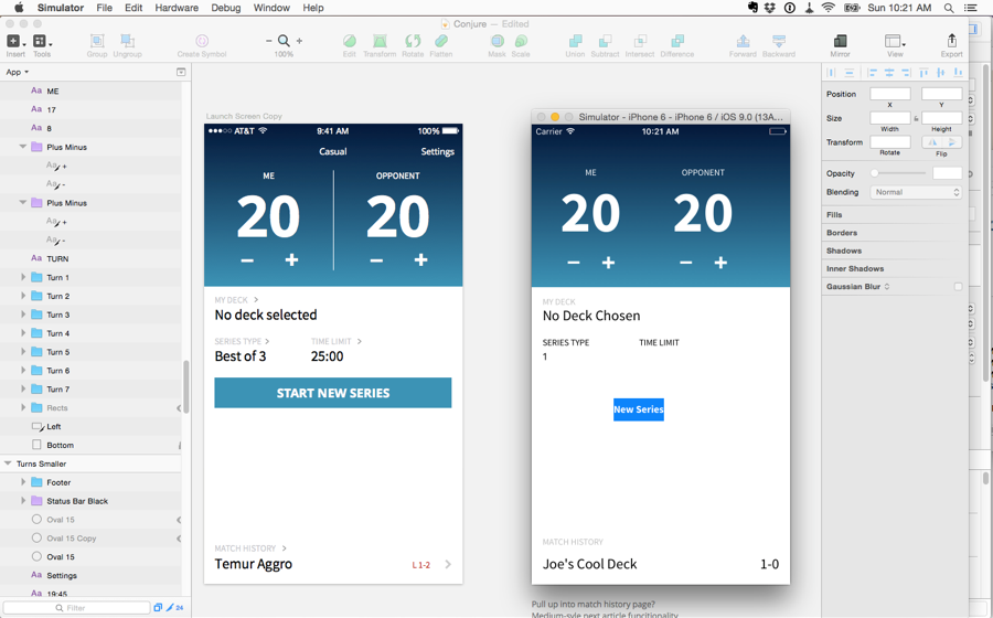
Magic: The Gathering is a card game where players bring a deck of spells, creatures and resources to battle against other players and reduce their life total from 20 to 0 (usually). Players build their decks from sets of cards that are released multiple times every year, and are always building new decks or altering existing archetypes.
I committed the first bit of code to Github in July, but I had spent a couple weeks noodling this issue I had noticed while playing Magic at some local shops. Most Magic life-counter apps show two large numbers with some tap able buttons to increase or decrease the number. The design led me to believe the intended setup was putting the device between the two players on the table so they were each interacting with their individual life totals. This wasn’t reflecting how I saw most players record their games, which was more often two columns on a piece of paper where they tracked both players.
This seemed like a better system for an app to me and leaned towards more serious players, which I felt were underserved by current apps.
Swift 2
The last time I jumped into Xcode I found myself struggling stay afloat in Objective-C, with only the faintest notion of app architecture. I managed to get by with the excellent Big Nerd Ranch Objective-C textbook but it wasn’t exactly a grand slam for someone with no real programming experience. Two years later, after working in proximity with a number of actual software engineers I have a much more nuanced understanding of programming and set off with the Apple introduction to Swift.
The Swift Starter Guide is such an excellent resource, I would have no problem recommending it to anyone interested in Swift development. It got me set up with a basic app, passing data around between view controllers, constructing views both visually in Interface Builder and programmatically, and utilizing almost all the different basic data types.
The language itself flows well and feels readable when skimming statements to make sure your intent is clear. I found this to be a hugely welcome change from the previous bewilderment I experienced trying to place all the requisite brackets in Objective-C.
It’s hard to overstate the effect this modern syntax had on development. Documentation was easy to read, stackOverflow questions were plentiful and clear. By the time I submitted the app, I was able to solve my own crashes, construct efficient logic statements and functions; a far cry from my previous development efforts. Even now as I look at all the source code, I can roughly place where in the timeline I developed each feature based on how well it’s constructed and the number of comments I had to leave myself like “Fix this bullshit math”.
Swift 2 is a very cautious language, opting for safety when dealing with unknown variables rather than opening nil values and crashing the application. This philosophy greatly improved the quality of my code by forcing me to construct my view controllers and models appropriately rather than face potential crashes from rookie shortcuts.
The Design Loop
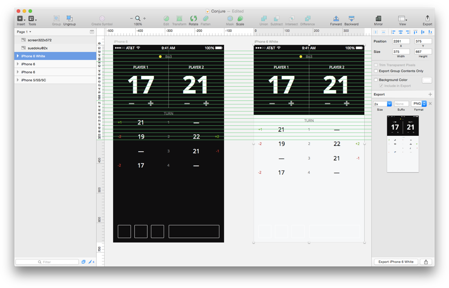
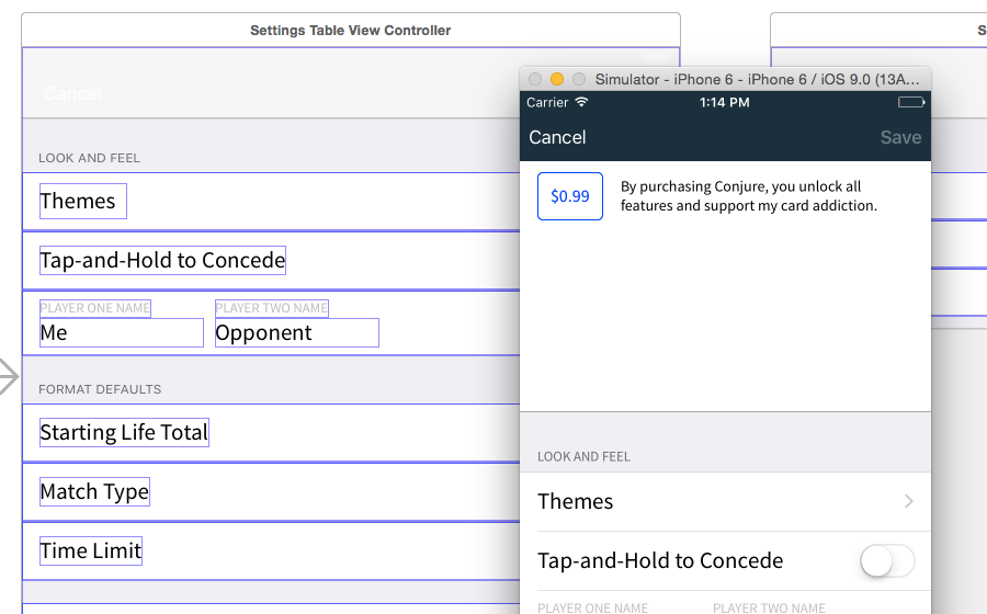
The actual interface design of the app started in a notebook and moved from there into Sketch. Within a day or two I had the basic functionality designed and had decided on most of the distinguishing characteristics. As you’ll see later, the initial designs have a passing resemblance to the final app, but a lot of decisions and polish were added in realtime, as I worked in Xcode and with the device on my phone.
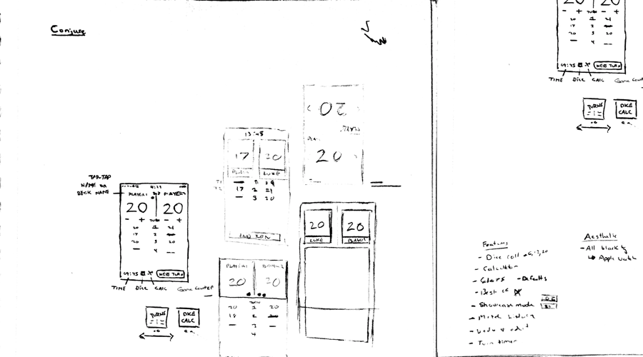
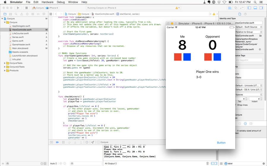
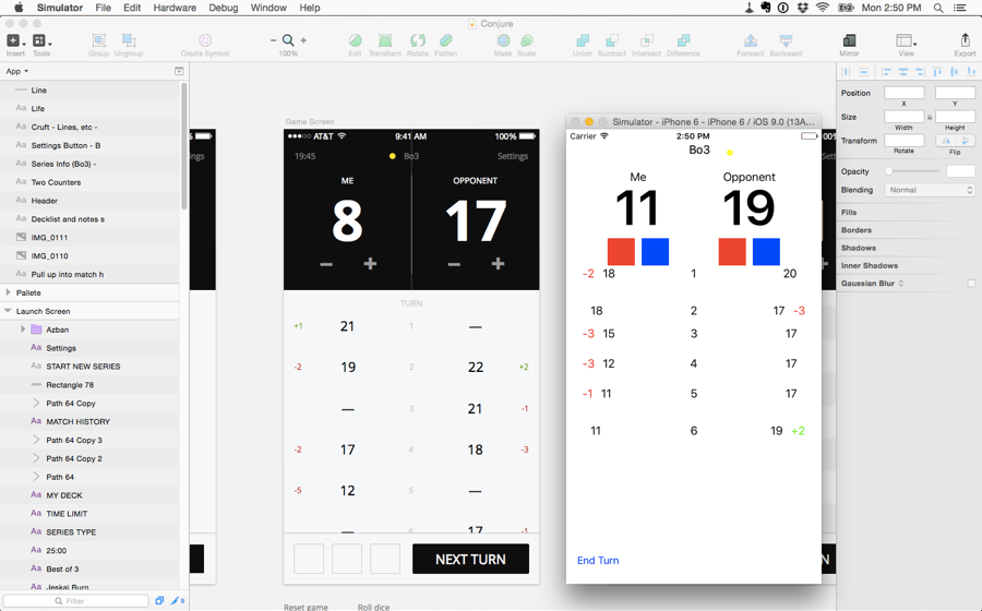
The original color scheme ended up feeling a little bland, but survived as an unlockable dark theme. Fonts changed, button sizes and table rows were all tweaked based on how the app felt in my hand, a luxury I was afforded being the sole designer and developer. While not 100% designed in xCode, a lot of the app details became apparent in Interface Builder and the Simulator, rather than in Sketch.
Aside from some Interface Builder squabbles where I crossed the wires between programmatic and IB views, tweaking was simple and I even managed to write some AutoLayout constraints (a crowning achievement) that adapted to your device size. Soon I was able to roughly match the Sketch ideas to a working interface.
The difficult part of this call-and-response design loop is finding when to stop fiddling and lock your designs and when things are still malleable. As a personal project with no deadline and no financial need to ship, I could alter my designs as many times as I wanted. My feet were dragging in the final weeks of development, when I had only a couple small things left to do. My coworkers kept reminding me that building an app doesn’t count until it’s shipped. I eventually gave myself a deadline and only let myself do tweaks that were necessary UX enhancements. Having the solid boundaries of a deadline gave me a final push of energy to finish strong.
Features and Shipping
The problem with a timeline and a deadline is that you often can’t do everything well or sometimes can’t do it at all. Some of the features that got dropped from version 1 were a small calculator, infect counters, turn editing and dice rolling simulation - features that got edged out of the interface and some that I never used in my play testing anyways.
Limiting features in order to ship is a double sided sword in many regards. It’s kept my app functionality clean and focused, but maybe I’ve missed out on some polish or features that would really enhance the experience. Oftentimes I hear the phrase “Minimum Viable Product”, which is a iterative software design philosophy based on getting working products into people’s hands as soon as possible and iterating with additional features and polish. Unfortunately this sometimes leads to poor 1.0 releases that don’t have enough dedicated resources to see substantial 1.1 and 1.2 releases. I already have a list already for future features and sections to refactor after the 1.0 release, so there definitely can be a future for many Conjure updates especially if it becomes popular or profitable.
I’ve had time and bandwidth concerns while thinking about this app, and had to mentally prepare myself for the responsibility of taking people’s money in exchange for a product. Marco Arment recently had to face a similar issue (in a much larger way) when his ad-blocking app became a much larger success than he anticipated and became “the guy who blocks ads”. My situation isn’t nearly as intensive, but at a times when I struggle to come home after work and open up Xcode, the idea of doing it perpetually isn’t so appealing.
Final words
I’m definitely somebody who thrives on side projects and having little puzzles to solve is a primary way I relax. I’ve often had trouble with hobbies and projects that begin to feel too much like regular work and become harder and harder to work on in spare time. I haven’t discovered a magic cure for that, but I’ve made my commitment to Conjure and produced an app that’s a real world interpretation of my vision. Building an app is something I’m proud of and taking it from doodle to published in just a couple months makes me confident in my understanding of product design best practices and my ability to self-motivate. Again all the code is available on Github, feel free to ask me any questions about the app, Swift resources I used or feature requests.